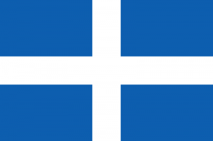
Microsoft spent time and effort to design the new logo of Windows 8. I assume that they wanted something simple because someone can create it in minutes. The result is not something new, it is a very old design from Greece and they used it as a flag between 1822 and 1978. To be fair enough, it is not exactly the same but the similarities are very obvious. The cross is thinner and there is a rotation, it is more like a redesign than a new innovative logo. There are variations of the flag of Greece that have similar color with the Windows 8 logo, thumbnails are not very good for the comparison, you can click on them and see the full size. Maybe the designer didn’t know how the Greek flag used to be or maybe he (or she) is from Greece and this logo shows his love for his country. Windows colors were a success and Google used the same colors to their web browser’s logo.